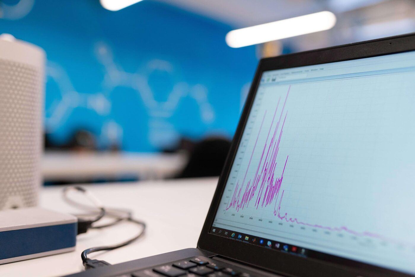
SEO Blog
This is where you’ll find all our SEO-related blogs. It will keep you occupied for hours. Want to know more about how we can help your brand? Find out about our SEO services.


Digital Ideas Monthly
Sign up now and get our free monthly email. It’s filled with our favourite pieces of the news from the industry, SEO, PPC, Social Media and more. And, don’t forget - it’s free, so why haven’t you signed up already?
We create cutting edge, award-winning digital marketing campaigns


Questions?
Call us on 0330 353 0300, email info@koozai.com or fill out our Contact Form.
Lancashire Digital Marketing Agency Cotton Court Business Centre
Church Street, Preston
Lancashire, PR1 3BY, UK