
We love digital 0330 353 0300
This March [2026] we undertook the inaugral UK Ecommerce Speed Index. We tested 460 pages across approximately 150 of the UK’s biggest online retailers. Here is what we found, and what it means for your business.
This report looks at how quickly UK ecommerce websites load and whether they meet the standards that Google uses to rank pages in search results. We tested around 150 UK online retailers, looking at three types of page on each site: the homepage, a category page (such as “women’s shoes”), and a product page. That gave us 460 pages to analyse in total.
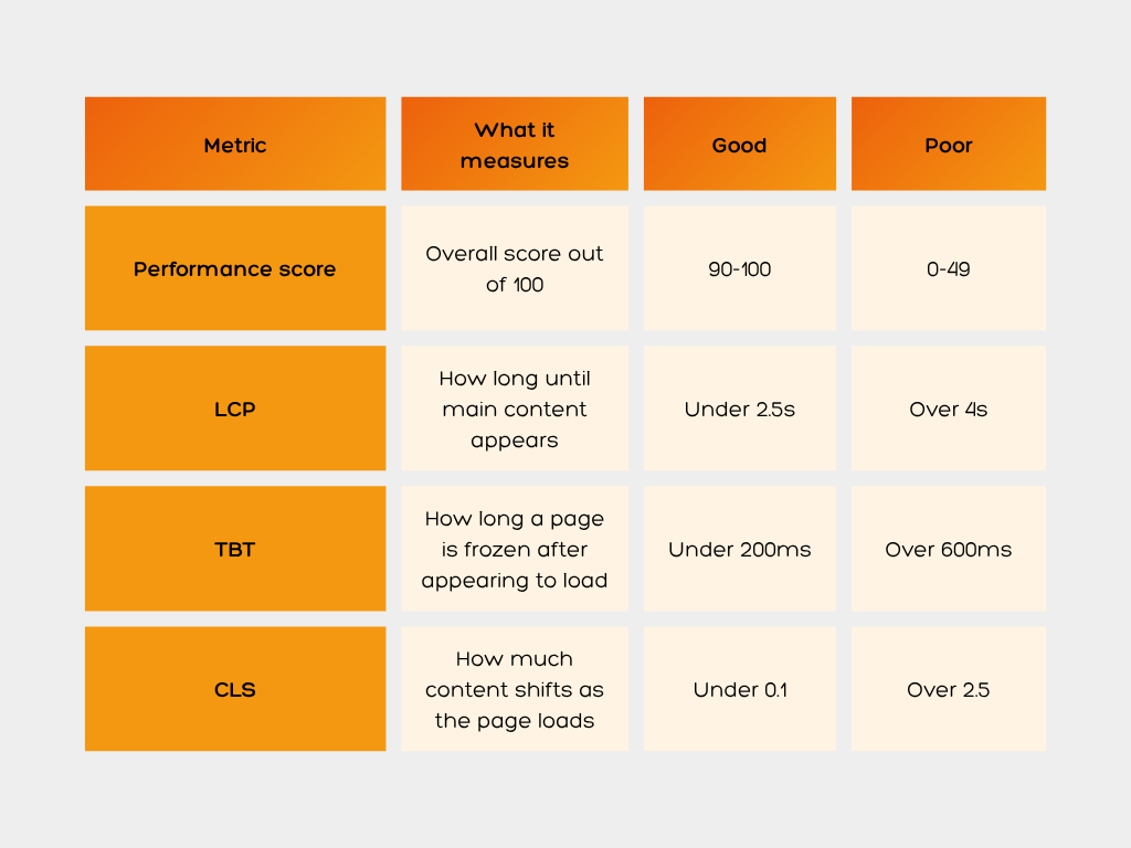
We used Google PageSpeed Insights (PSI) to collect the data, run through Screaming Frog. PSI scores each page out of 100 on a mobile connection and measures three key things:
Together, LCP, TBT and CLS make up what Google calls Core Web Vitals (CWV). These are used as a direct ranking signal in Google Search.
Jump straight to the sector you are most interested in:
The short version: the state of web performance across UK ecommerce is poor. Almost universally poor. Regardless of the sector, the brand size or the marketing budget, the vast majority of UK retail websites are failing to meet the basic speed standards that Google has set, and that shoppers expect.
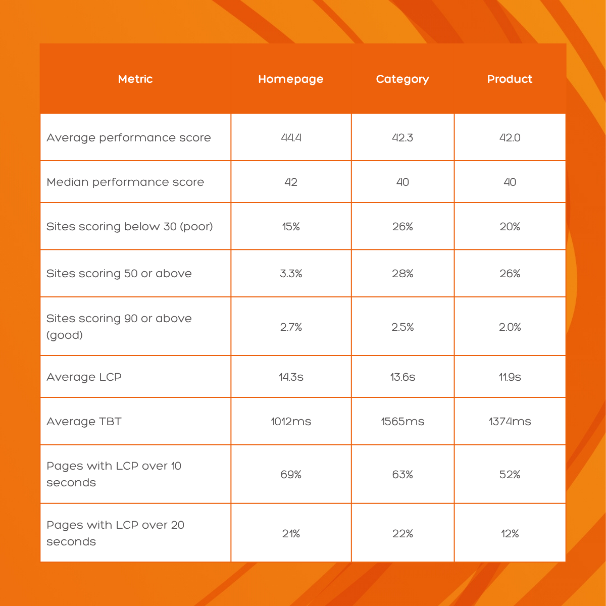
The standout finding: Only 1 to 2 per cent of the 460 pages we tested have a “good” LCP score. That means 98 to 99 per cent of pages are loading their main content too slowly by Google’s own definition. The average page takes between 12 and 14 seconds to load its main content. Google’s good threshold is 2.5 seconds.
The average performance score stays stubbornly around 43 out of 100 regardless of whether we are looking at homepages, category pages or product pages. This tells us the problem is not limited to one part of a website, it runs through the whole thing.
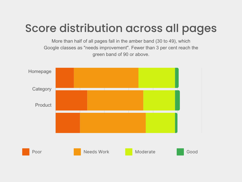
The chart below shows how performance scores spread across all 460 pages. More than half fall in the amber band (30 to 49), which Google classes as “needs improvement”. Fewer than 3 per cent reach the green band of 90 or above.
Page speed has a direct impact on three things that every online retailer cares about.
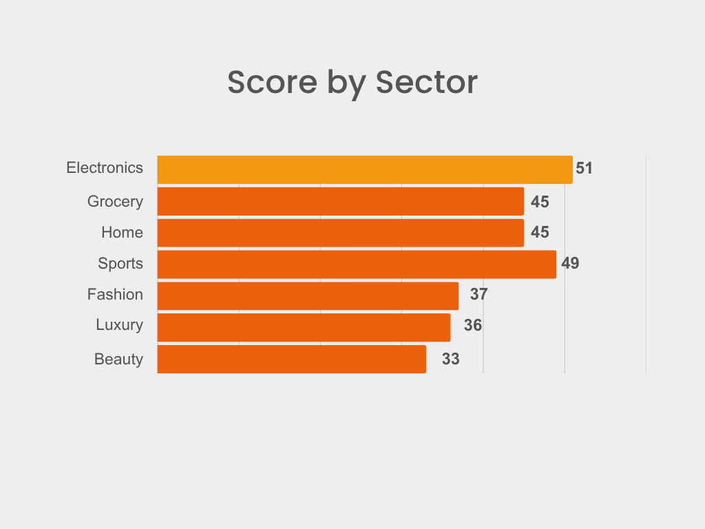
There are clear differences between sectors. Electronics and technology retailers tend to perform best, partly because their audiences are more technically minded and partly because their sites often carry fewer heavy assets. Fashion and beauty come out worst, and the reason is usually the same: too much JavaScript (JS), too many third-party tools, and heavy imagery that has not been properly optimised.
TBT is arguably the most frustrating metric for shoppers. It measures how long a page looks like it has loaded but is actually frozen, you can see the buttons, but tapping them does nothing. Two thirds of all pages we tested had a TBT of over 600 milliseconds. The mean TBT on category pages was 1,565 milliseconds, meaning the average UK ecommerce category page leaves users unable to interact with it for over 1.5 seconds after it appears to have loaded.
*Google’s good threshold for TBT is under 200ms
**Google’s good threshold for LCP is under 2.5 seconds
The fashion sector is home to some of the best-known brands in UK ecommerce and some of the worst-performing websites we found. The combination of high-quality imagery, video content, personalisation tools and multiple third-party scripts creates a significant technical burden that most fashion retailers have not addressed.
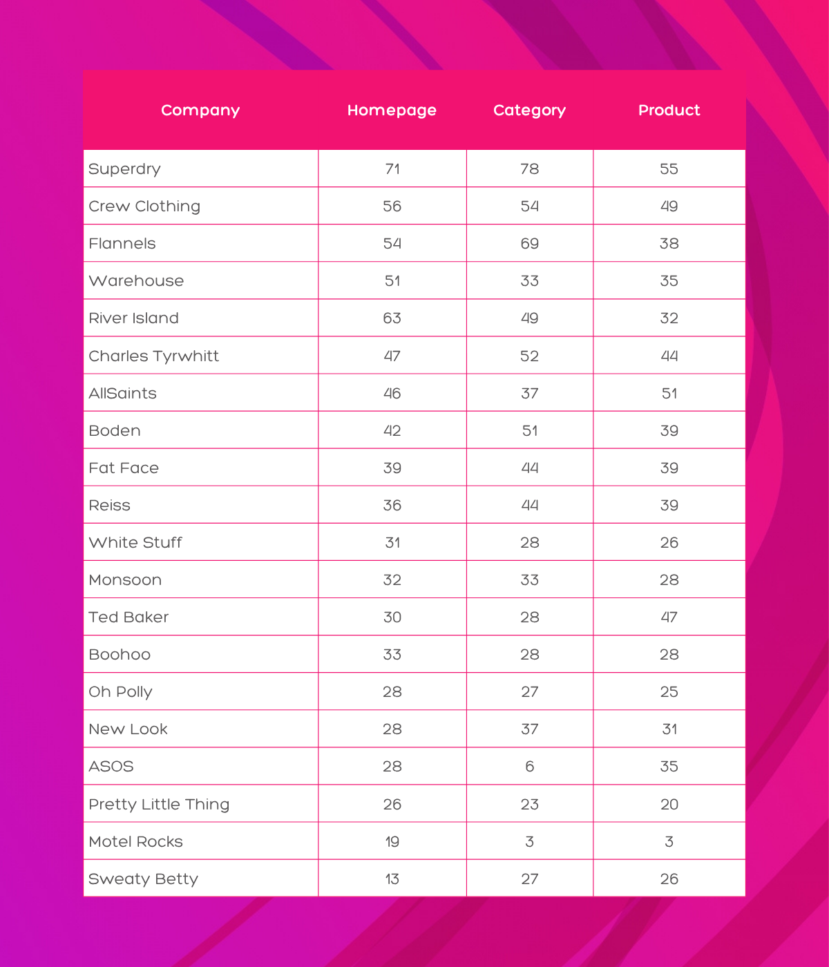
ASOS scores 28 on its homepage, below average, but not catastrophic. Its category page scores 6 out of 100. That is not a typo. One of the UK’s biggest fashion retailers has a category page that scores in single digits. For a site that generates hundreds of millions in online revenue, this is a significant commercial issue.
New Look’s homepage has a CLS score of 1.404. Google considers anything above 0.25 as poor. A score of 1.404 means that content is visibly jumping around the page as it loads; buttons, images and text are shifting into different positions. Anyone who has accidentally clicked “add to basket” when they meant to scroll has experienced this problem firsthand.
Bright spot: Superdry manages a homepage score of 71, a category page score of 78 and a product page score of 55, making it the clear leader in the fashion sector. Its average of 68 across all three page types is well above the industry average of 43.
Beauty is the sector with the most to lose from poor web performance. Shoppers searching for specific products often have high purchase intent; they know what they want and they are ready to buy. A slow, frustrating page experience pushes them straight to a competitor.
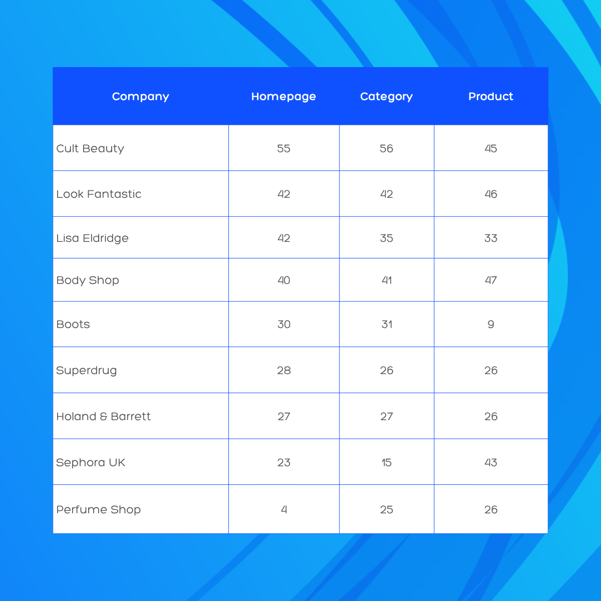
Boots scores 30 on its homepage and just 9 on its product pages. Its Fenty Beauty product page takes 39.5 seconds to load its main content. Its homepage TBT is 5,520 milliseconds, meaning shoppers sit looking at a frozen page for over five seconds after it appears to have loaded. Boots is one of the UK’s largest retailers. The commercial cost of this performance level is likely substantial.
The Perfume Shop’s homepage scores 4 out of 100. Its TBT is 4,306 milliseconds and its CLS is 0.571, the page is both frozen and visibly jumping around. The irony is that its category and product pages score 25 and 26 respectively, which suggests the homepage has an acute problem that the rest of the site does not share. That is fixable, but it has to be a priority.
Holland and Barrett’s scores are essentially the same across all three page types (27, 27, 26). This level of consistency in poor performance suggests a structural issue with the platform rather than a one-off problem. Every page they publish starts from the same weak foundation.
Grocery is an interesting sector in this data. Speed matters enormously here because grocery shoppers are typically task-focused, they want to find their items, add them to the basket and check out as quickly as possible. A slow, laggy experience creates friction at every step of that journey.
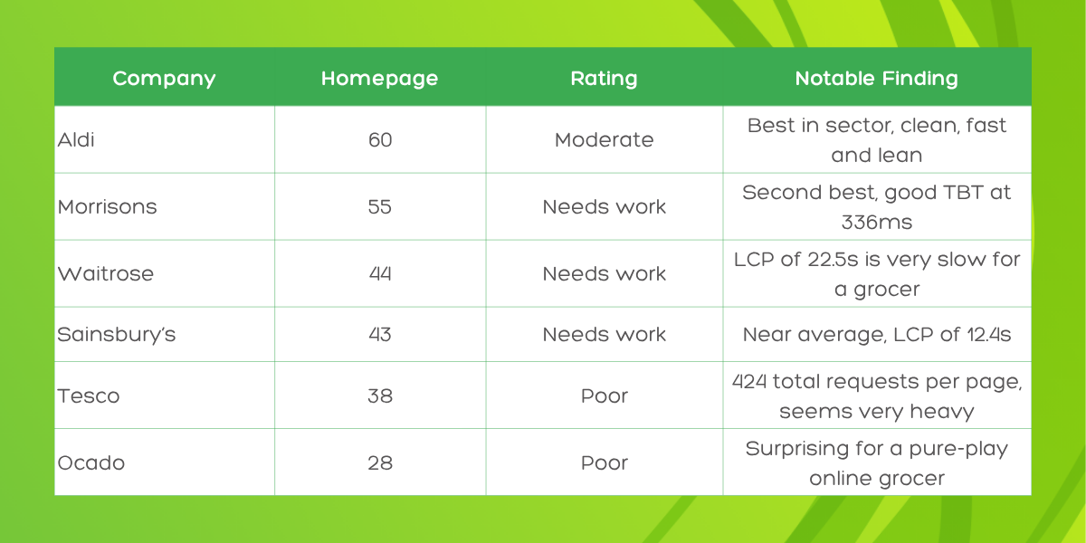
Ocado scores 28 on its homepage. This is the most surprising result in the grocery sector. Ocado is a pure-play online grocer; its entire business model is built around digital commerce. Yet it scores below Aldi, Morrisons, Waitrose and Sainsbury’s. Its homepage LCP is 21.8 seconds and its TBT is 2,233 milliseconds.
The two discount grocers in this dataset are also the fastest. Aldi scores 60 on its homepage with an LCP of 7.9 seconds and a TBT of just 204 milliseconds. Morrisons scores 55 with a TBT of 336 milliseconds. Both are considerably leaner in terms of page weight than their premium competitors, which points to the connection between visual complexity and poor performance.
Tesco’s homepage makes 424 separate network requests per page load. For context, a well-optimised page typically makes fewer than 100. Each request is a round trip to a server, the more you make, the slower the page becomes. Reducing this figure should be a priority for Tesco’s development team.
Electronics and technology retailers perform better than most other sectors in this report. The irony of technology companies having some of the web’s fastest sites is not lost on us, but there is a genuine logic to it. Electronics audiences tend to be more technically minded, which historically pushed these retailers to invest more in performance. Not all of them have kept up, however.
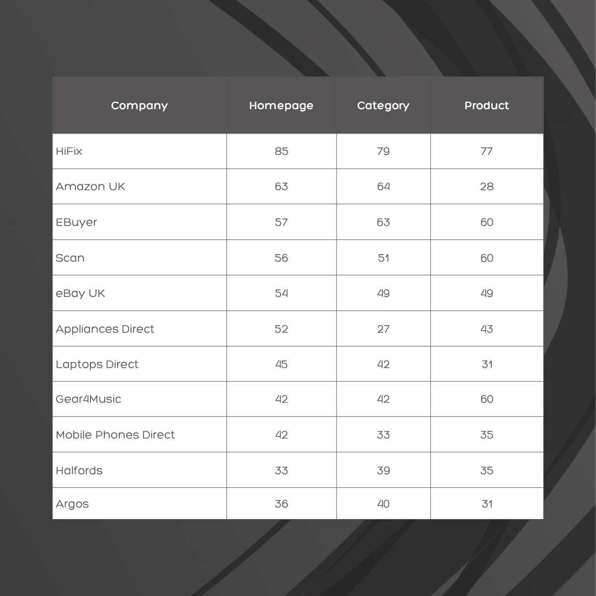
Amazon’s homepage scores 63; above the dataset average and a reasonable result. Its product pages score just 28. That is a drop of 35 points between the page that creates the first impression and the page where the sale is made. This pattern, investing in homepage performance while neglecting product pages, is one of the most commercially damaging mistakes we see across the whole dataset.
HiFix scores 86 on its homepage, 79 on its category page and 77 on its product page. That is an average of 81 across all three page types, making it one of the top five performers in the entire dataset. It is a specialist hi-fi retailer with a fraction of the budget of Amazon or Argos, and it is significantly faster than both.
Halfords scores 33 on its homepage, with a TBT of 5,970 milliseconds. This puts it near the bottom of the electronics and technology group, and below the overall industry average. Its homepage also carries over 1MB of media with suboptimal compression. For a retailer competing heavily in click-and-collect, a frustrating mobile experience is a particular problem.
Home and furniture is a sector where the purchase journey often starts with browsing and inspiration. Category pages are critical for this sector; shoppers filter, compare and scroll through products before clicking through to individual items. Category page performance here is therefore particularly important. The data shows it is also particularly problematic.
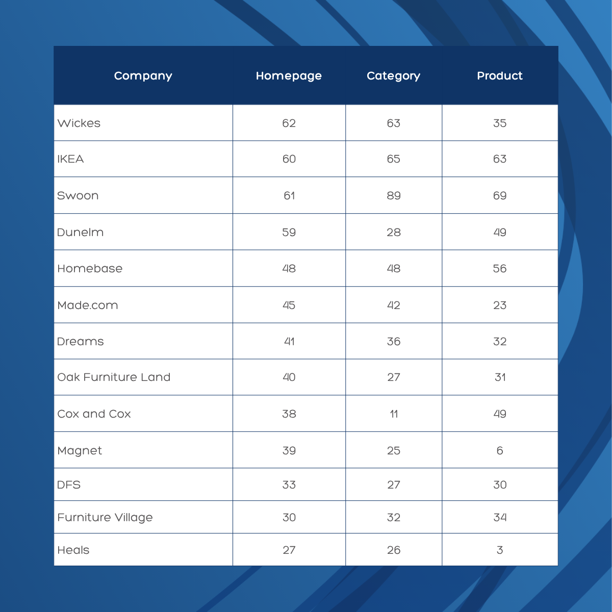
The single worst LCP result across all 460 pages we tested belongs to Made.com’s sofas category page, at 47.3 seconds. This is the page that shoppers land on when browsing for sofas, one of the highest-value product categories in the entire furniture market. A shopper with thousands to spend on a sofa is sitting there for 47 seconds waiting for the page to load. The likelihood of them still being there is very low.
IKEA scores 60 on its homepage, 63 on its category page and 66 on its product page. Its average of 63 across all three page types makes it one of the most consistent performers in this sector. It also demonstrates the right direction of travel: product pages should ideally perform as well as, or better than, the homepage, and for IKEA they do.
Dunelm scores 59 on its homepage and 57 on its product pages, a solid result. But its category page scores just 32. More telling is the TBT figure: 8,184 milliseconds on the category page, compared to 1,399 milliseconds on the product page. Something specific to how the category page loads its JavaScript is causing a severe freeze that does not exist elsewhere on the site.
Heals scores 3 out of 100 on its product page. That is the second-lowest product page score in the entire dataset. Its homepage loads 22.7MB of content in total and its product pages carry 5.3MB of JavaScript. The site is handling extremely heavy page weights throughout.
Luxury brands spend considerable amounts of money on their digital presence. Rich photography, video content, brand storytelling and premium user experience (UX) are all central to how these retailers present themselves online. The data suggests, however, that this investment in aesthetics has come at a significant cost to performance.
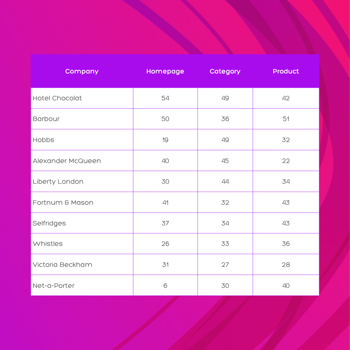
Net-a-Porter’s homepage scores 6 out of 100. Its homepage carries nearly 15MB of total content and 14.3MB of JavaScript. For context, 14.3MB of JS is approximately 48 times Google’s recommended JS budget. Its homepage also has a CLS of 0.571, meaning content is jumping around as it loads. Net-a-Porter is one of the most recognisable luxury fashion retailers in the world, its website is one of the most technically challenged in the UK ecommerce landscape.
The fundamental tension in luxury ecommerce is this: the visual experience that communicates premium quality; high-resolution imagery, video, animations, is precisely what makes pages slow. The brands that resolve this tension successfully use aggressive asset optimisation, lazy loading and modern image formats to maintain the visual quality without the performance penalty. Most of the brands in this sector do not yet have appeared to have made that investment.
Converse scores 6 on its homepage. Its CLS score is 0.857, on a scale where 0.25 is poor, Converse is at more than three times that level. Every time someone visits the Converse homepage, the page shifts content significantly as it loads. This is not a good look for a brand that prides itself on being culturally sharp.
The sports and outdoors sector shows more variation than most. Smaller specialist retailers, cycling shops, outdoor gear stores, tend to outperform the large general sports chains, which carry heavier page weights and more complex filtering and personalisation functionality.
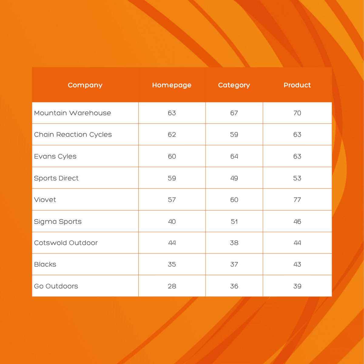
Mountain Warehouse scores 63 on its homepage, 67 on its category page and 70 on its product page. This is one of the few sites in the entire dataset where performance improves as you go deeper into the purchase journey, which is exactly what should happen. Its average of 67 across all three page types is well above the industry average.
Sports Direct scores 59 on its homepage, a reasonable result. But its category page drops to 42 and its TBT on the category page climbs to 661 milliseconds. The category page carries nearly 400KB of additional CSS compared to the homepage and loads significantly more third-party requests. This is a fixable problem but it requires deliberate attention to category page optimisation specifically.
Chain Reaction Cycles (62), Evans Cycles (60) and Viovet (57, with a product page score of 77) are all performing well above the retail average. All three are specialist retailers with lean, focused websites. Their page weights are significantly lower than the general sports chains, and they carry fewer third-party marketing scripts.
In a dataset full of underperformance, the sites that score consistently well across all three page types tell us something genuinely useful. They are not all tech companies with enormous engineering teams. Several of them are small or mid-sized retailers with modest budgets. What they have in common is a lean approach to how they build and maintain their websites.
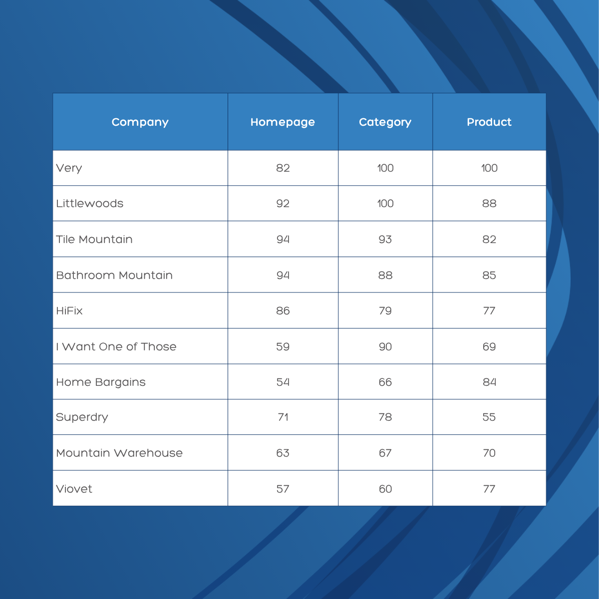
Very scores 100 on both its category page and its product page. Littlewoods scores 100 on its category page. Both are part of the same parent company, Shop Direct. This is not a coincidence, it reflects a deliberate, platform-level investment in web performance that the rest of the UK retail industry has not made. If Very and Littlewoods can do it, there is no technical reason why other retailers cannot.
Goldsmiths scores 88 on its homepage and 95 on its product page, one of the highest product page scores in the entire dataset. Its TBT on the homepage is 0 milliseconds, meaning the page becomes fully interactive almost instantly. This is exceptional and shows what is possible even for a high-end retailer in a visually demanding sector.
One of the most commercially important findings in this report is the gap between homepage performance and product page performance for certain retailers. A well-maintained homepage can create the impression of a fast, professional website while product pages, where purchase decisions are actually made, are quietly failing.
Think of it this way: if your shop window looks great but the aisles inside are a mess, you are still losing sales. The homepage is the shop window. Product pages are where the sale happens.
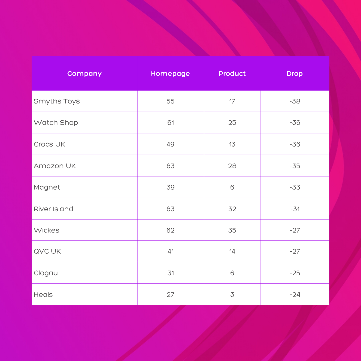
Crocs’ homepage scores 49, not great, but not catastrophic. Its category page scores 9 and has a CLS of 2.999. Its product page scores 13 and has a CLS of 2.455. Content is shifting by nearly three times the height of the screen as pages load. Shoppers who manage to reach a product they want to buy are doing so on a page that is visibly unstable and very difficult to interact with.
Not everyone gets worse at product pages. A handful of sites actually improve:
These retailers show that with the right focus, product pages can and should be the fastest part of a site, because that is where the money is made.
If your site is in this report and your scores are below where you would like them to be, here is where to start. These are the most high-impact changes, in order of how quickly they are likely to move the needle.
JS bloat is the single biggest driver of poor performance across this entire dataset. The average UK ecommerce site loads 1.8MB to 2.1MB of JavaScript per page. Google’s recommended budget is under 300KB. Start by auditing what is running on your site. Third-party scripts; chat tools, marketing trackers, A/B testing tools, personalisation engines, each add weight. Remove what you do not need. Defer what you do not need immediately. Minify what remains.
Quick check: Open your site in Chrome, press F12 to open developer tools, click the “Network” tab and reload the page. Filter by “JS”. How much are you loading? If it is over 1MB on mobile, you have a problem to fix.
Images are typically the largest element on any page, making them the LCP candidate in most cases. Use WebP format where possible (it is on average 30 per cent smaller than JPEG at the same quality). Set explicit width and height attributes on images to prevent layout shift. Use lazy loading for images that are off-screen on initial load. Serve appropriately sized images for each device rather than scaling down a large desktop image on mobile.
Many of the worst-performing sites in this dataset are loading 100 or more third-party requests per page. Every third-party script creates a dependency on an external server, and if that server is slow, your page is slow. Audit every third-party tool on your site and ask whether the value it provides justifies the performance cost. Then set a strict process for approving new third-party tools before they are added.
The data is clear: homepages are frequently better maintained than category and product pages. This is the wrong order of priority. Category and product pages are where shoppers make purchase decisions. A homepage that looks great but leads to a slow product page is not a good user experience and it will not convert well. Apply the same performance standards to every page type, with product pages at the top of the list.
All the scores in this report are measured on a simulated mobile connection, because that is how the majority of UK shoppers browse. If you only ever test your site on a fast office Wi-Fi connection, you are not seeing what most of your customers see. Use Google PageSpeed Insights (pagespeed.web.dev) to check your scores and see exactly which issues are dragging your performance down. It is free and gives you a specific list of what to fix.
If you would like to understand exactly what is slowing your site down and what the commercial impact is likely to be, our team can give you a detailed technical audit alongside a clear list of recommendations. Get in touch and we will take a look.
We conducted a detailed performance review of key pages across multiple UK ecommerce sites, focusing on homepages, product listing pages (PLPs), and product detail pages (PDPs). These page types were selected because they represent the primary entry points and conversion pathways for users.
Data was gathered using Screaming Frog SEO Spider integrated with the PageSpeed Insights API, crawling all relevant URLs while capturing mobile-specific Core Web Vitals (LCP, FID, CLS), Lighthouse performance scores, and detailed resource metrics including HTML, CSS, JavaScript, images, fonts, and third-party scripts.
Following data extraction, the results were exported, cleaned, and normalised for analysis. We:
This approach provides a focused view of the mobile user experience, helping to identify pages with slow load times, layout shifts, or heavy resource usage, which are critical for engagement and conversions.
We tested approximately 150 UK ecommerce websites, collecting data from three page types on each site:
This gave us 460 pages in total. Where PSI returned an error or the request did not complete, the result was excluded from calculations.
For enquiries about this research: www.koozai.com/contact


