
We love digital 0330 353 0300

In June, Laura posted a great list of ways to understand user behaviour on your website. Best of all if you can interpret user behaviour on your site then you have the ability to improve conversions and usability. We’ve also posted some tips in the past on what you can be testing on your site.
All of this means CRO has never been easier. As more agencies and businesses release data about tests they’ve performed, the more we can feel inspired to improve our sites and make a better web for internet users.
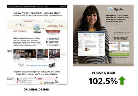
I love this case study because 37signals tested radically different page designs, not just going with iterative changes. After seeing some good improvements making their Home page longer and more informative they decided to try something completely different. The original page was a nicely illustrated page full of information, photos, testimonials and widgets. The other featured a large photo with less information but a couple of screenshots.
If you refresh the page in question, you can see they are still split testing the photos.
You can also read a much older post when they started to split test headlines long before looking at total redesigns.
Note: This case study is a bit out of date now as SEOmoz has completely re branded to Moz and changed all their media, however the results are still very useful.
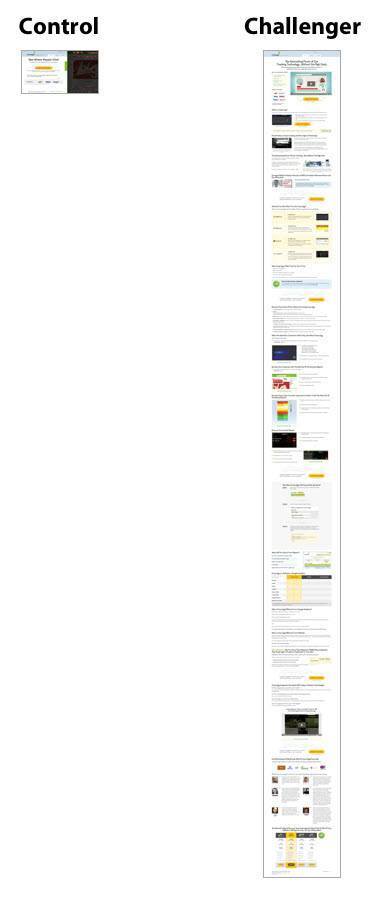
The process of reaching $1 million in revenue took different steps. The first step was to design and test a completely new landing page to tell more of a story. On this page a new style of headline was implemented, a video was added and a clear product level table was included.
Finally an irresistible special offer for the first month of the service was also given to users, however customer retention and lifetime value remained the priority.
Sunshine.co.uk is a popular holiday site in the UK that Conversion Rate Experts analysed and tested to help increase revenue by a massive £14million.
Firstly they created an enticing email to gather previous customer insight via survey software. Along with collecting customer opinions about their website experience, private user testing services were implemented to gather more data and make improvements to the website before changes were put live. Once the site was live, continuous split testing refined the conversion rates further.
More data from the survey helped Conversion Rate Experts choose which key points to prominently show on the Home page. These points cleared up most visitors’ questions when they arrived at the site.
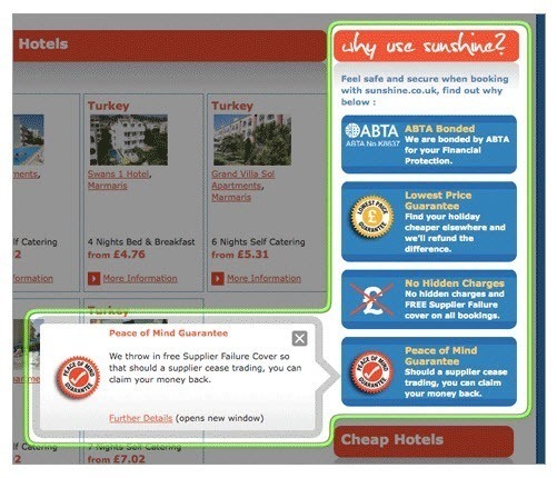
Another important change was clarifying what customers got for the price as many were put off by the low prices thinking they didn’t include everything.
These improvements delivered a massive $14 million increase in turnover.
Widerfunnel helped EA achieve 128% more Sims 3 game registrations by performing a/b tests on a selection of game page variations. Different messaging and offers were tested against each other to find the most compelling option.

Simply a/b testing different offers worked well for this brand and shows that the offer is very important to users.
No pricing, offers or content were changed, simply the visual aspect of BaseKit’s pricing page was tested to help increase conversions by 25%. The new design was “Bolder, brighter, had clearer pricing, a nicer design, a testimonial and more obvious currency selection.”
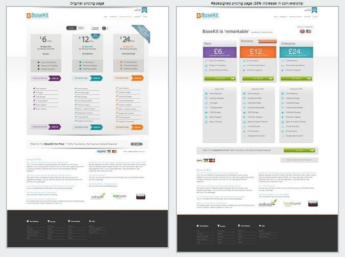
Website design is so subjective and many people settle for a design that the business likes, however this case study shows that tweaking a design for users can help significantly with conversions.
Here is another great case study for redesigning a landing page and improving conversions based on more attractive layout.
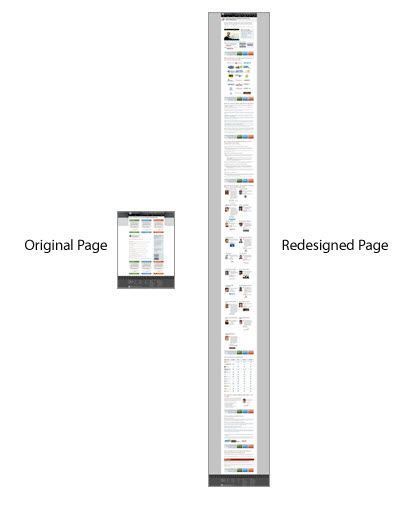
Further optimisation resulted in a total of 363% more sign ups. The Longer Home page was part of a large CRO project by Conversion Rate Experts. The page was 20 times longer than the original Home page. It shows that their visitors were keen to learn more about the product and have their questions answered before signing up.
The use of video, special offers and an optimised checkout helped increase signups further.
Some believe that a shorter page would prevent user drop off and encourage sign ups. However for certain products it’s important to explain the product in detail and offer answers to questions and assurances to help conversions.
A shorter page can also help increase conversions for other brands where the longer page was restricting conversions (Source).
By adding more options to narrow down product searches, BuyaKilt.com grew their revenue significantly. Product filters are now very common on eCommerce systems and users expect to see them.
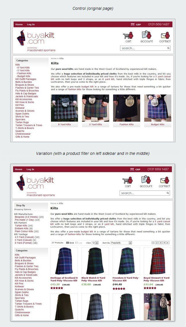
It’s not always the case that having lots of product filters is going to help your ecommerce performance. In another test, UKToolCentre.co.uk found that removing the option to filter products down and freeing up valuable above the fold space helped increase visitor engagement by 27% (Source).
ContentVerve found moving the call to action form under the content helped increase signups by a massive 304% for one of their clients. Organising the call to action into the natural flow on the landing page made sense to most of its visitors.
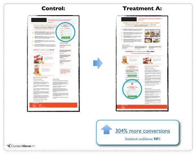
There are cases for having call to actions above the fold but in complex or valuable products, having it succeed the product or service information can work much better.
Video is a great way of engaging users and conveying information but sometimes simple imagery works better. Five sliding images described the Device Magic service and increased sign ups.
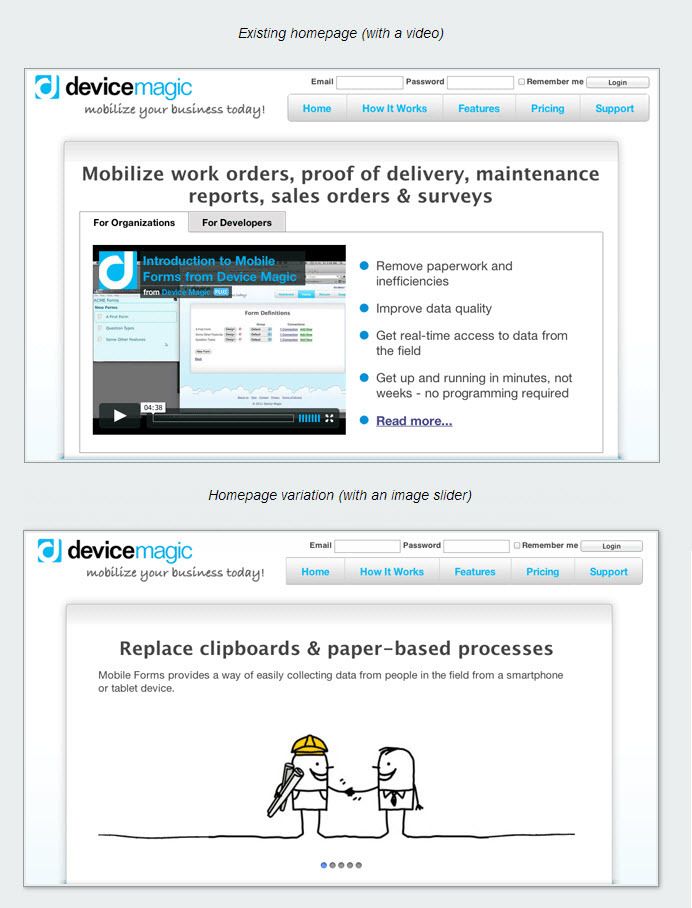
Find the best format to present to your visitors by testing, not assuming either video, imagery or text will work best.
Here’s a simple case of making a call to action stand out more or invoke a different response by just changing the colour. It’s true that colour can have an impact on the emotions of users, however it can sometimes simply just make things stand out better.
Conversion Rate Optimisation needn’t be complex, a single change can make a large difference.
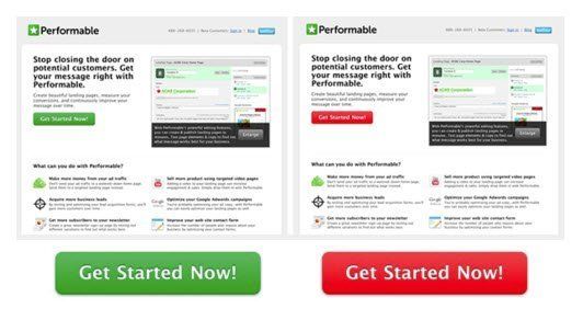
Adding a product demonstration on the landing page for Performable also increased conversions significantly as reported in this separate case study.
If you’ve not had enough motivation to get optimising then keep up to date with the latest Conversion Rate test results on a site called ABTests.com. If you think you understand CRO more, practice your ability to spot the better converting page at WhichTestWon.com.
Image Credit
Test tubes closeup on blue background. Drops from test stick from BigStockPhoto


